In this article we’re going to talk about one of the most difficult pages to design on your website – the Homepage. Our homepage design tips will not only help you understand why getting homepage design right is important, they’ll also help you to generate more traffic to sales content and goal conversion.

Why is homepage design so difficult?
Simple – there are often lots of stakeholders with different demands and sales targets to meet. Most will want their content as high as possible on the homepage to make it most visible, and often this content will be a single product at the top of their ‘must sell’ list. Working out how to manage that can be quite a challenge.
Homepage Design Tips part 1 – what’s out there?
In terms of homepage design, you just need to look at the range of different designs out there to see that some are mind-bogglingly complex while others are so ‘simple’ you struggle to understand what they’re selling.

Wow! Where to click...

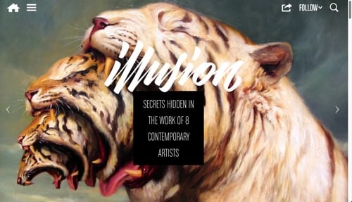
Hmm.... Does this site sell boots??
Get it wrong and visitors may just ‘click on by’ (to torture the lyrics of a well known song). Sadly the current ‘in vogue’ homepage design trends are moving towards product banner heavy promotional content

More banners anyone?

Your wish is my command...
and mobile design formats for desktop viewed sites – where icons are used extensively instead of text. The following is a classic case in point. By removing the navigation tabs and any visual cues or content this website struggles to get its message across as to what it’s actually for.
The Return of Kitsch
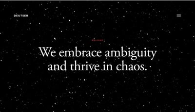
Perhaps worst of all is the trend for kitsch video landing pages which ironically hark back to the bad old days of flash-based ‘splash pages’ – these were dedicated landing pages playing video to try and impress you (both of which took ages to load and sometimes play). After the moving ‘entertainment’ had finished you were then left with a single text link or button that said “Enter Here”. A very poor and frustrating experience, which everyone who promotes great online customer experience was glad to see the back of. However, some trendy designers are now bringing them back – cast your eyes in wonderment at www.deutser.com. Below is a screenshot just to prove my point…
So, what’s right for your business?
Homepage Design Tips part 2 – how visitors read content
To find out how visitors read your website content you need to understand what sort of thing visitors are looking for and how the average visitor’s brain is working when they land on your sites content…

What Website Designers Want Visitors To Do

What Homepage Visitors Actually Do
What you’ll find if you track your users mouse movements is that visitors don’t do what you want them to do – i.e. read everything on the homepage and then click the relevant link. They’ll quickly scan the homepage looking for a likely link to click. That’s why, if your homepage isn’t well designed, you’ll often see page visit data showing a lot of rapid back and forth visits from and back to the homepage.
Different Ways Visitors Navigate
In general the people visiting your homepage can be split into 3 main groups in terms of their preferred method of navigating your content:-
- Tab Navigators
- Content Clickers
- Site Search(ers)
Let’s look a little more closely at these user groups..
Homepage Design Tips part 3 – tab navigators
The Tab Navigator group is primarily driven by the navigation tabs at the top of every page in your site.
Mega Drop Downs
In the last few years most websites have dramatically improved the effectiveness of this method of navigation by implementing ‘mega drop down’ (or ‘mega menu’) technology – a method to temporarily expand the tab heading to show a more detailed series of headings behind the main tab element.

In the example above visitors can easily explore the ‘Electricals’ section of the site without having to click anything.
Contrast Between Active and Inactive Tabs
What you may also notice is that the appearance between ‘active’ and ‘inactive’ heading elements (i.e. the foreground section activated by the mouse hover-over and the background header sections which aren’t highlighted) hasn’t been designed with a high enough contrast between them. Looking at the image you have to look closely to see that the ‘Electricals’ heading is slightly lighter in colour than the non-highlighted headings.
Mouseover Delay
If you decide to use mega drop downs, make sure the active elements stand out clearly and that the revealed content doesn’t disappear too quickly when the user moves their mouse. Sometimes visitors are almost forced into a game of ‘chase the content’ in order to click the target before it vanishes!
Tab Target Size
The next thing to consider is the size of the tab/text area that the visitor needs to aim the mouse pointer at (this is called the ‘target’). If you just use text as the clickable target you may find it’s too small for some users – especially if they’re visually impaired or older users with poorer co-ordination skills. Small target sizes also impact mobile users trying to interact with your site – on average around 30% of your visitors will be on a mobile device…. Now that’s something to think about.
Navigation Tab Language
One other point to mention covered in my previous post “Top 5 Website Optimisation Tips” is to use the customers language when naming navigation tab headings – don’t label it ‘oranges’ when it actually contains ‘apples’. This might sound stupid but I’ve seen many website owners trying to ‘differentiate’ their products from the competition by naming them completely differently. Even large organisations aren’t immune*; HSBC calls it’s business credit card “Commercial Card”, which has virtually no searches in Google.
*Sometimes the product naming isn’t always in the website owners control. In HSBCs example the product name was defined by the Product Managers long before it was promoted online.
Homepage Design Tips part 4 – content clickers
Content Clickers by their very nature like to interact with the main content on the homepage, or any page they’re visiting for that matter.

The image here illustrates this point clearly. In aggregate most visitors for this site show a preference for content rather than the tab navigation. You’ll also notice that a lot of visitors plumb straight for the site search function shown here extreme top centre (slightly to the right) of the page heading structure (called a ‘masthead’) – more on this later.
In order to help visitors quickly scan your homepage for a likely link that may take them to where they want to go, we need to look again at how our brain works.
Fight or Flight, Images vs. Text
Genetically we humans are hard-wired to recognise images much faster and easier than text. Most human studies track this back to our days as hunter-gatherers, when recognising a threat quickly often saved your life. So use this hard-wired receptor and make sure you always include imagery as well as text to clearly represent the various category sections and structure of your website as laid out by your top level navigation tabs. Driven by this relevant imagery and text, content clickers will follow your carefully crafted links deeper into your site. But…. Use too simple or too complex a homepage or fill it with banner ads and you’re likely to confuse, overwhelm and distract your visitors away from their primary goal – finding the product they came to your site to buy…. unless of course that’s your aim!
Large Online Retailers – rule breakers
This distraction-based homepage design format is used all the time by large online retailers, but it’s popularity is down to ‘follow my leader’ design driven by just one or two big names, rather than informed user-centred design. Ostensibly this is to encourage you to buy products you didn’t intend to purchase. Whether this works though is questionable, especially for the Content Clickers whose main format of navigation has been taken away. Often visitors to your site have been driven to do so by a complex mix of reasons – some seasonal, some personal and some driven by various online and offline media promotions. Distracting users from their primary objective is nearly always a bad idea as it breaks this impulse connection and can lead to a lower value sale or no sale at all.
Follow Best Practice
For smaller retailers with a less well known brand a barrage of distracting banner ads on the homepage is not the right way to go. Unlike the large online retailers, who have invested heavily in customer awareness about what they sell how good their service is and the slickness of their delivery, smaller retailers can’t compete in this market. Consequently they will be less well known so their product range needs to be easily understood from a visit to their homepage. Make this job difficult and you’re likely to see a visitor click to a site they can easily understand. It’s always best to follow design best practice and promote content navigation as part of your customer oriented navigation design strategy.
Products in Focus
However, that’s not to say you can’t implement banner promotions as part your homepage design. Having a clearly defined area for seasonal products or products you’ve spent money promoting is a good idea as unfamiliar visitors following up on your marketing will likely land on your homepage and be looking for visual cues. The exception to this is where a clickable link is involved in your marketing, in which case they’ll likely end up on your category or product page. Advanced marketing techniques can target specific banner promotions to individual visitors, with decisions about what gets showed based on previous visits, the data available in the link from the site they’ve come from and the ad they’ve clicked on (each ad will have an individual identifier). There are far more sophisticated techniques around but they’re very expensive.
Content and Label Language
One last comment about content and their labels. Make sure they make sense to the general public – i.e. the images and text – and do not try to be clever with puns or unique product titles only you would recognise. Remember visitors will only click a link if they’re confident they know what it will lead to.
Homepage Design Tips part 5 – site searchers
As we saw in the Content Clickers section some visitors won’t bother with tab or content navigation but go straight to the site search box.  This is a very important lesson. Always make sure you have a site search box for this type of visitor.
Site Searchers Convert More
There is a lot of evidence that visitors who use the search box to find your products are significantly more likely to buy the product than by other types of navigation. Some studies suggest that conversion rates can be up to 175% higher for Site Searchers.
Don’t Play With Search Box Design
I’ve seen and experienced a wide range of sites that have tried to be clever with site search boxes – that’s in addition to those sites that haven’t had a site search tool at all! You’d be amazed at the amount of time a ‘Site Searcher’ will spend trying – vainly – to find a box that looks like a site search function on a site. I’ve witnessed this many times in user testing and the golden rule is ‘always have one’.
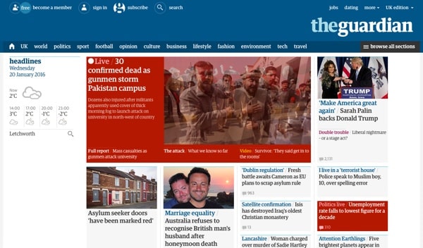
Here ‘The Guardian’ has designed a field in the masthead which at first glance looks like it should be the search box (dark grey at far right). But this is actually a link to a rather complicated filter page. The real search box is hidden away at the very top of the page and is only activated when the visitor clicks the magnifying glass icon or ‘search’ text.
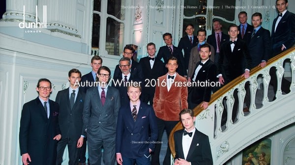
Dunhill goes one step further and not only does away with the helpful ‘search’ text label – which incidentally, as with the Guardian example, makes the click target much bigger and easier to select – but also makes spotting it much harder by the use of a full background image which confuses the eye and acts as a camouflage for the masthead navigation elements. To sum up, ‘clever’ designs can have a major impact on the use and effectiveness of search boxes. It’s best to avoid search boxes that use the same colour background as the masthead (other than white) or are hidden within weird coloured shapes. Magnifying glass icons are not ideal for desktop designs as it forces users to make an extra click before search can begin, as well as being smaller and harder to spot on larger real-estate. Unfortunately many themes used to create websites are hard-coded with this type of search design (like ours above) and they’re not easy to change just for desktop formats. Having some form of site search is much more preferable to having none though.

Be sure your site search box isn’t ‘hidden’ in plain site within the main content either (see above) – i.e. ‘designed’ to fit in with other boxes or fields with similar sizes and/or shapes on the page. Also keep the placement of the search box consistent throughout the site – no-one wants to play hide and seek with a website function.
Search Box Design Tips
So here’s a few top tips for site search design:-
- Don’t be tempted to ‘play’ with site search design – it’s a vital tool for many visitors.
- The rule is keep it simple, consistent (in terms of design and placement, on all pages) and very visible. The easiest way to do this is to incorporate the site search box within the masthead – the main header section of the site that stays the same no matter what page you’re on*. I covered Masthead design in my previous blog “Top 5 Website Optimisation Tips” so if in doubt go check this out.
- It should be a large-ish element that’s easy to spot.
- If your masthead isn’t white, don’t try and blend the search box colour to match the background. If it is make sure the outline of the search box is bold enough to be noticed.
- Avoid using mobile design formats (magnifying glass icon) for desktop – space isn’t as limited and you force users to make an extra click before search input can begin.
- It should be able to take the average sized input without obscuring parts of what the visitor has typed. Related to this is text size….
- Text size for the site search box (as with the rest of the site) should be large enough to be easily read by elderly people and those with poorer eyesight – it’s not fun trying to read and correct what you’ve typed when the font size is tiny.
- To submit the search request, allow the visitor to click the magnifying glass icon or hit the return key.
*Except for checkout processes which do require special treatment when it comes to navigation links
Search Box Functionality
One other thing to consider when implementing a site search function on your site is the quality of the search results. Again I’ve experienced many different types of site search results, some very poor and some really rather accurate but let down by their really unfriendly result layout. If your site has a lot of content and/or products it’s probably a good idea to look for a dedicated site search box function like that from Google. This will not only make sure all of your content is accurately spidered but will also help with searches that are mis-spelt, pluralised, or missing words.  Results need to be cleanly and clearly filtered too so that the user can easily understand what’s being displayed and make their selection.
That concludes our quick(ish) look at homepage design. There is far more to consider than just these highlights but hopefully these homepage design tips will help you to understand the visitors’ mind-set when they land on your site, and help you to avoid the pitfalls that some well known sites have fallen into (and really should have known better). If you think others could benefit please don’t hesitate to share or forward to them.
If you’d like to find out more about how sales optimisation can improve your website call us on 01438940548 or contact us via Twitter, Facebook or Google+. If you’d prefer to email us you can contact us here: info@salesoptimisation.co.uk
Recent Comments