Designing a great homepage

Designing a great homepage

Homepage design

Getting your homepage design just right

Getting your homepage design just right is a major task. Ask three people about their first online impression of you and you’ll probably get four – or more – answers.

It’s particularly hard when your website needs to appeal to customers, employees and suppliers and you’ve got no more than a few seconds to make a great first impression.

You have to juggle design, photography and words – what takes precedence and why?

Your homepage is not there for you…

The most important thing to remember is that your homepage isn’t there for you. Unless you are selling to yourself, you’re not the target audience. Make sure that when you’ve created your homepage, you ask some trusted friends for their opinion. And listen to what they say. Specifically ask them if they understand what you sell or do from the first 3 – 5 seconds of seeing your homepage.

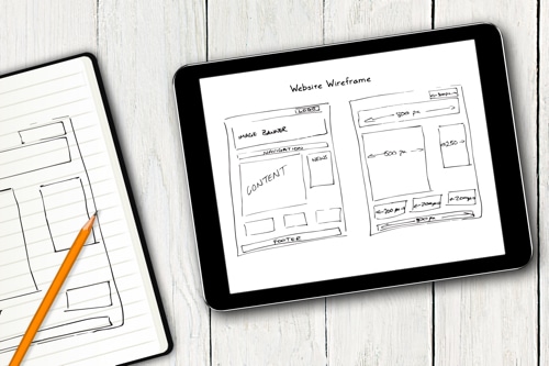
Banners or not? Icons instead of text? Lots and lots of text telling your whole story? Minimal colour or a single, bold image?

Should you include a random selection of products that you sell? Will it help or confuse visitors?

What about navigation? Should you hide it behind a fashionable three bar “Hamburger” navigation icon to make your design clean and fresh or leave the traditional tabs in place?

The choices you make affect the visitor journey

The choices you make with homepage design will influence how long a potential customer spends on your site before they turn to your competitor instead. And, of course – no matter how interesting your story actually is – few people will read every word on your home page before clicking through, searching, or switching off.

Great design, eye-catching relevant and meaningful images that aren’t obviously from a stock library and engaging text will firstly welcome your visitor and then direct them to the best page for their next step. Since your homepage will probably get more clicks than your other pages, it’s important to get it right first before you move on to products and services pages. Your homepage might not be the one that converts visitors to customers, but it does tell them a lot about your brand and what you sell.

Keep it simple stupid… 🙂

In general, keep your design and your message simple and if your brand isn’t clear on the homepage, you’ll lose out.

We have a great, in-depth homepage design blog that will help answer some of your issues and, of course, contact us directly for a more personal response.

Website Tab Navigation Isn’t Enough

Website Tab Navigation Isn’t Enough


Website Tab Navigation Isn't EnoughWhy website tab navigation isn’t enough…

Did you know that the visitors to your site can be broken down into 3 types of navigator?

When designing a website and especially a homepage you need to take into account the 3 different preferences people have when browsing online.

Website designers and therefore website designs tend to consider visitors as one amorphous lump of online prospects, but in reality they respond very differently to the way your site is designed.


3 Main Browsing Types of Visitors


Site Searchers

Site searchers tend to be people who know what they want . They’ll type in the name of the product or service they’re looking for in your search box.

Because they already know the name of the product or service they’re looking for, you’re going have problems if you’ve decided to give your products or services a unique name to be ‘different’.  The reality is your products won’t be found. Not only that you’ll have just lost a visitor and the ‘bounce’ could affect your relevancy score for future search result rankings.

So be conventional. Call your products and services by the name everyone knows them as.

Tip: make sure the site search system you’re using is a good quality one – they’re not all the same. Some out of the box site search offerings are poor, either in terms of actually finding the products being searched for or displaying them in an easy to understand and engaging format.


Tab Navigators

Most web designs are built around the assumption that every visitor is a tab navigator.  It’s true that tab navigation on your website is very important.  It gives visitors an instant understanding about what your website is about and the breadth of products or services your company offers – all without having to click a button.

Mega drop down menus (those menus that show more options when you hover a mouse pointer over them) are another great invention that allows visitors to see more of your content.  They can then decide whether to invest their time to progress further into your site without having to invest a mouse click.

On the subject of mouse clicks you should consider each click a visitor has to make as a considered investment by them. They’re weighing up time spent towards the likelihood of finding the thing they’re looking for against a waste of time which they could have spent better elsewhere.

So make the words you use to describe each navigational element (tab heading) meaningful and logical – don’t make the visitor think about what products or services are hidden behind each heading or they’re likely to leave.

Tip: don’t hide website tab navigation behind the three bar hamburger menu icons on desktop or tablet – it’s ok on smartphone form factors (but even some pioneering designs are shunning it here too).


Content Navigators

Content navigators on the other hand are, as the name implies, content junkies.  These visitors prefer to interact with the content of a page rather than the dedicated navigational elements like the navigation tabs or site search box.

Unfortunately most homepages don’t have a structure which even closely resembles the layout of the various categories of products or services on offer by the site.  It’s usually just a massive promotional image with a random collection of ‘products in focus’, often driven by the demands of the various product managers within the business.

So what?  It’s not that important is it?

You may be surprised to learn than on average more than 50% of your visitors to your homepage will want use the content to navigate rather than either site search or tab navigation.

It’s not surprising really when you consider that only around 30% of your total page visits will be to the homepage – the vast majority will be interacting with your product and category pages and… you guessed it they’ll be predominantly interacting with the content on those pages and not the tab navigation.

Unless you’re a household name spending £100,000’s a month on advertising your visitors will not know the range of products or services your sell, and they won’t spend long looking through every navigation tab to get a feeling for what you sell either.

Tip: make sure the content on your homepage represents the information architecture and tab navigation structure of your site.  On a recent client project we saw an increase in content navigation to 60% of total homepage interaction. This lead to over 50% higher clicks to deeper content – all by redesigning the homepage to reflect the site structure. Find out more about homepage design


Let’s Work Together

To find out more about how we’ve helped other businesses improve their online and offline performance get in touch using the contact form, via email at [email protected] or calling us on +44 1462 887334

Top Homepage Design Tips

Top Homepage Design Tips

In this article we’re going to talk about one of the most difficult pages to design on your website – the Homepage.  Our homepage design tips will not only help you understand why getting homepage design right is important, they’ll also help you to generate more traffic to sales content and goal conversion.  (more…)